Little children have been taught to not “judge a book by its cover,” but let’s face it– that’s just one of the many things we never really follow. Reality is: The cover matters.
And so does your podcast cover art and logo.
Given a wide selection of podcasts on shelves, what do you think entices your listeners to try out your show?
Mind you, during the first-level of browsing, audiences don’t usually get to see the podcast description and show notes. Your podcast cover art is the first thing that must pass the test.
Of course, you must have quality content in order to retain your podcast audiences. That includes your recording, editing, and other post-production matters. All of these things work hand-in-hand to make a successful podcast.
In this article, we’ll provide the ultimate guide, do’s and don’ts, tips, and everything related to designing your podcast covers. We’ve looked through most resources (so you don’t have to) and summarized them below (and added our takes):
Podcast Cover Dimensions and Requirements
Each podcast directory has its own podcast cover requirements…Fortunately, as a rule of thumb, following the Apple Podcast Requirements would work on all other podcast directories!
- Shape: Square
- Size: 3000 x 3000 pixels preferred
- (No smaller than 1400×1400 px)
- File Type: JPEG or PNG
- RGB Color Recommended
Best Podcast Cover Software and Designers
1. Canva
Canva is the go-to software that is Free and Easy to use. Their podcast cover templates are already set at 3000 x 3000 pixels by default.
With Canva, you can easily customize, resize, add, and remove podcast elements, words, photos, and graphics. The platform also contains an extensive free-to-use graphics library that makes it easy for even non-designers to create their own podcast covers.
It is important to note that not everything is free on Canva. Some elements, graphics, fronts, and tools are exclusive to Canva Pro (& above) users.
Image/ canvas resizing is a paid feature that is super helpful for making consistent artwork across different social media accounts and other publications. The GOOD NEWS is that you can work around this road bump by re-designing (or copy and pasting) your cover elements on another template.
2. Adobe Creative Cloud Express (Adobe Spark)
Adobe Spark is a great alternative that’s also Free and Easy to use. They’ve got a number of templates and even provide podcast cover templates that you can later on resize for free. This is great for creating different sizes for all your social media and promotion needs.
When comparing Canva and Adobe Spark, Canva has more templates, digital assets, and much more stunning designs when compared to Adobe Spark.
However, Adobe Spark does come with its perks. As part of Adobe Creative Cloud, you can open and continue editing your works on other Adobe software like Photoshop, Illustrator, and Lightroom.
3. Fiverr
Fiverr is a great freelance service platform. You can hire designers to create your ideal, perfect podcast cover art at a price range you’re comfortable with. You can also specify exactly what design you’d like to have. Payment method and checkout is pretty simple with a few different options such as credit cards, PayPal, and Fiverr credits.
After briefly browsing through the podcast cover art listings, you can get pretty good cover designs for as low as $10 to $15. On the upper threshold, there are gigs that list for $50 and higher. Do take note, however, that Fiverr may be adding in some service fees on top of the seller’s price.
The great thing about hiring a freelance designer on Fiverr is that you have samples and designer portfolios to browse through and work with. If you have something in mind, you can inquire of the artists whether they could make it happen. If you have nothing in mind, you get to gain inspiration or even seek advice from these designers.
A good and close alternative to Fiverr is Upwork.
4. Dribbble
Unlike Fiverr, which is a freelance platform where you can find all sorts of gigs, Dribbble focuses on graphics and interface designs. Through Dribbble is mainly a platform for purchasing and contributing to digital assets like fonts and templates, you can also hire designers. The choices may be limited though!
The mood and aesthetics of podcast cover artworks are quite different and less diverse when compared to Fiverr.
5. BONUS: Unsplash
Although neither a software nor a freelance designer platform, Unsplash can still be pretty handy, especially when you’re looking to design your own podcast cover on Canva, Adobe Splash, or other graphic design platforms.
With Unsplash, you can get download and use beautiful, high-quality, and free-to-use images for whatever design or marketing publications your podcast may have. Whether it be a plain background, wallpaper, stock photo, professional shot, or landscape picture, Unsplash has a wide collection you can choose from.
Make it POP! : Cover Design Guide
In a pool of podcast covers, what’s going to make yours stand out? Learn from the best, tried-and-tested marketing psychology concepts and make your podcast cover art POP!
1. Color Psychology Marketing and Branding
You may have heard of color psychology before, the study of how brand colors affect customer impressions, which affect their purchasing decisions.
Scrolling through the podcast collections looking for something to listen to is a form of shopping, in which case color psychology remains to be an effective tool for shows to influence audience decision (to listen to your show).
Although this may be affected by personal experiences, preferences, and other subjective views, colors can usually show brand personality. We’ll summarize the main colors and their perceived personalities, as provided by Iconic Fox, shared by marketing expert, Hubspot. Open the following toggles to see what each color means for brands:
- Personality: Bold, Adventurous, Energetic
- Brand Samples: Coca-Cola, Netflix, Canon, H&M
- Practical Usage: Urgency, Appetite (fast food), Pulse (speed, sensuality)
- Personality: Adventurous, Competitive, Confidence, Warmth
- Brand Samples: Amazon, Mastercard, Mozilla Firefox, Nickelodeon
- Practical Usage: Bright, Light, & Fun (suites non-corporate), Earthy (autumn), warmth (sun)
- Personality: Independence, Optimism, Impulsive
- Brand Samples: McDonald’s, Best Buy, Shell, Post-it, DHL
- Practical Usage: Positive emotions, Powerful with dark colors, Sunshine
- Personality: Authentic, Open, Friendly
- Brand Samples: Starbucks, Android, Whole Foods, XBOX
- Practical Usage: Relaxing, Health (organic and pharmaceuticals), Life, Growth
- Personality: Loyal, Social, Security, Trust
- Brand Samples: Facebook, Ford, VISA, NIVEA, PayPal
- Practical Usage: Strength, Wisdom, Calmness, Suppresses appetite
- Personality: Dignified, Sensitive, Understanding
- Brand Samples: Yahoo!, Cadbury, Hallmark, Taco Bell, BenQ
- Practical Usage: Superiority and loyalty, Prestige, Moody (may be associated to femininity)
- Personality: Femininity, Practical, Caring, Innovative
- Brand Samples: COSMOPOLITAN, Barbie, Victoria’s Secret, Indiegogo
- Practical Usage: Youth, Hope, Comfort, Spiritual
- Personality: Decisive, Serious, Confident, Sophistication
- Brand Samples: Nike, Loreal, CHANEL, MTV, Puma
- Practical Usage: Power, Luxury, Fashion, Simplistic
- Personality: Independent, Innocent, Clean, Optimistic
- Brand Samples: Apple, Tesla, Lexus, SONY, adidas
- Practical Usage: Modern look and feel, Minimalistic, Sleek
Color shade matters. Design matters. Color is just one out of many aspects, and these color personalities are generalized perceptions that may not apply to ALL brands. Surely, some exceptions stand out.
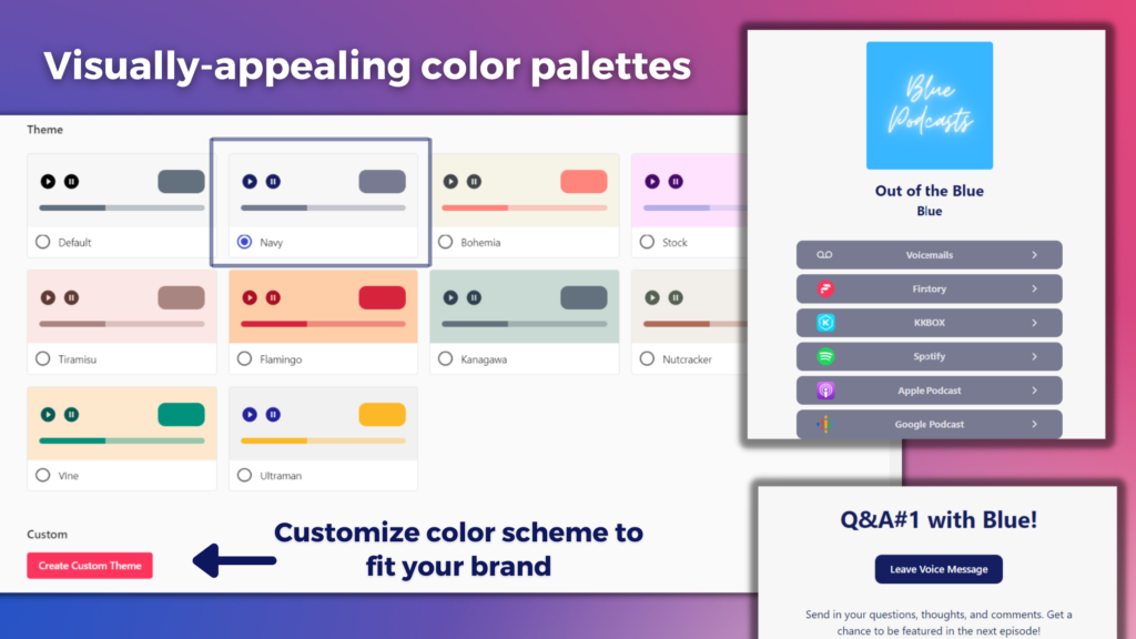
Knowing the importance of color to branding and customer (listener) behavior, Firstory PRO & above users are able to choose and customize color palettes to match their podcast branding for their auto-generated website, embedded player, FLink tool, Voicemail, and other Firstory pages.
To set your Firstory color palette, visit your Promotion Settings page.
2. Color Theory and Color Schemes
Color theory tells us how and which colors to use to create a harmonious, logical, eye-pleasing color aesthetic. Simply put, it talks about which colors go well with which others to make an image POP!
Take a color wheel. Basic color theory tells us that the following work well together:
- Analogous colors – Take 3 colors that are side-by-side on the color wheel. (Example: Green and Red– Mountain Dew)
- Complementary colors – Take 2 colors directly oppostite each other on the color wheel. (Example: Red, Orange, Yellow– Fritolay)
- Triadic colors– Take 3 equally-spaced colors from the color wheel, drawing a triangle shape. (Example: Blue, Yellow, and Red– Burger King)
Hues, tint, shade, and tone also matter. They must also be harmonious with each other.
Firstory’s color palette gives podcast creators the freedom to set their own color schemes. Not only do you have to care about the mood and impression your color picks are giving off; you also have to take notice of whether they go well together to really be visually appealing and stand out!
3. Font Psychology and Typology
In the same way that color affects customer (audience) behavior by giving off a certain personality, fonts have the same effect. Marketing experts have refined this study through decades of research and empirical evidence. We’ve put together key takeaways on font psychology materials below. Open the toggle to view each font type personality and usage:
- Description: Contains a small stroke or line attached to larger (or main) strokes
- Famous Fonts: Times New Roman, Garamond, Georgia
- Personality: Trust, Respect, Authority, Formality
- Practical Usage: Law Firms, Financial Companies, Consultants
- Brand Examples: VOGUE, Tiffany & Co., J.P. Morgan, McKinsey & Co.
- Description: Serif fonts without the small strokes at the end of long (main) strokes that make Serif fonts “Serif.”
- Famous Fonts: Arial, Calibri, Helvetica, Proxima Nova
- Personality: Modern, Straight-forward, Cutting-edge, Trust
- Practical Usage: Fashion companies, Tech companies, Startups
- Brand Examples: Google, Walmart, Facebook, NETFLIX, adidas
- Description: Script writing which is often more elaborate and detailed than other font styles.
- Famous Fonts: Pacificio, Lobster, Allura, Rochester, Milkshake
- Personality: Elegant, Sophisticated, Personal, Fun, Traditional, Creative
- Practical Usage: Food and beverage, Fashion brands, Children-focused brands
- Brand Examples: Kellogg’s, Sharpie, Ford, Barbie, Coca-Cola, Johnson & Johnson
Choose the right font that matches your podcast theme. For example, you’re less likely to use Script-Styled Fonts for serious and tragic true-crime podcasts. However, comedy podcasts may benefit from this style.
Use font psychology to your advantage; elicit certain emotions and impressions from your podcast cover alone!
Whichever words or fonts you use, make sure that it’s EFFORTLESSLY READABLE. Don’t cramp your cover with a ton of words. Mind wordiness and readability.
4. POP! Factor
Tie it all together!
Does your podcast have a theme? Perhaps you are a Star Wars or Marvel fanatic podcast. Maybe you talk about Spongebob conspiracy theories. Make sure your cover reflects that. How? You can use their brand fonts, colors, and styles for your podcast cover!
Is your podcast personality-driven? Do you make podcasts decoding Taylor Swift’s infamous lyrical genius? Do you have Tom Holland as your co-host or constant guest? Make sure you have them on your cover.
Anyone who is a fan will UNDOUBTEDLY be drawn to your cover! You’re going to turn some heads 😉
5. Explicit Words and Images
No. Just don’t put it.
Some podcast sites, such as Apple Podcasts, have terms, conditions, or rules that do not permit explicit texts and images to show on your cover, which will likely lead to your show to being taken down.
“But my podcast is explicit. What can I do to represent this well?” Don’t bother blurring or pixelating images, because those will be taken down as well.
Go with innuendos or subtle (obvious) hints instead of straight-up explicit.
For obvious reasons, don’t make content or podcast covers that represent or advocate violence, drug use, illegal acts, profanity, and the like.
Compare and Contrast
Do your research. Look into others’ podcast covers, especially those from the same category, genre, theme, or topic. You don’t want to just be another boring old cover blending into the crowd.
“You weren’t made to fit in. You were born to stand out.”
We want our podcast cover to POP when placed alongside others’ numerous covers on the shelves, but make sure it stands out for the right reasons. You can also draw inspiration from others’ cover designs, but don’t copy! Stay original.
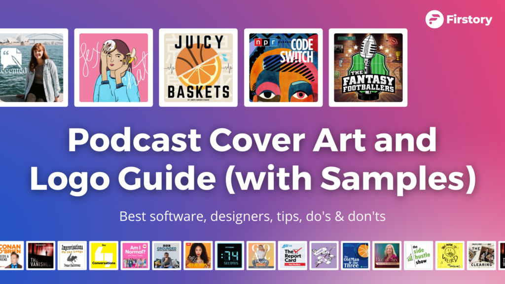
Samples! (Good and Bad Podcast Covers)
Good podcast covers represent their show well, conveys the right message and mood, stands out, and is aesthetically appealing. Not-so-good podcast covers CAN be visually appealing. But some of them may be misleading or unable to convey their message very well.
We picked out some GREAT visually-appealing podcast covers (they pretty much stood out among the rest in their genre), sorted them by category. BUT are they communicating the right message inline with their podcast content? Here, we gave our two cents on these select designs’ conveyed message:
(NOTE: Cover design thoughts and opinion do not represent what we think of the podcast SHOW. We’re only focusing on the visual communication of their podcast cover art)
Am I Normal? (Society & Culture)
- PROS: Great sans-serif font choice conveying modern and young energy.
- CONS: Doesn’t communicate the statistics and data part of her show. Color and illustration choices are easily misinterpreted as a children’s show.
Crossing the Line (True Crime)
- PROS: Yellow & Black resembles barricade tape, communicating True Crime impressions. Big Bold Sans-Serif letters that are straightforward.
The Fantasy Footballers (Sports)
- PROS: Football microphone head. Big, bold letters to convey power and energy.
- Mics are usually overused and overrated in podcast covers; but it works here due to the “sports” nature and creative twist.
The Old Man & The Three (Sports)
- CONS: Both font and color scheme do not communicate a sports impression and does not pop
- Host is an NBA sharpshooter, JJ Redick. The cover can be improved by using his photo or cut-out instead of a basketball on water (?)
Accented (Education)
- PROS: Subtle Australian landmark in the background, great at representing host’s background. Suitable Serif typology and paper-pen icon.
- CONS: White text on blue water doesn’t really pop and may be unreadable.
Need a Podcast Hosting Site?
So you now have an amazing podcast cover- awesome!
Now you just need to record your episodes and upload them onto a podcast hosting platform!
If you don’t have a hosting site yet or are looking for one, we invite you to try Firstory, the all-in-one platform for all your podcast needs including hosting, data analytics, promotion, searchability, and connecting with audiences.
Pingback: How to Start a Podcast? 5 Easy Steps to be a Podcaster! | The Firstory Blog
Pingback: Best Podcast Software and Equipment Reviews in 2022 | The Firstory Blog
Pingback: 5 Steps to Design an Awesome Podcast Cover Art | The Firstory Blog